
|
0 Comments
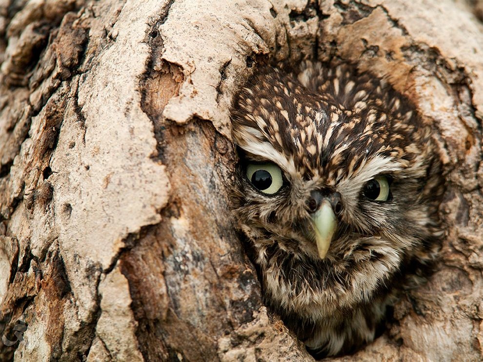 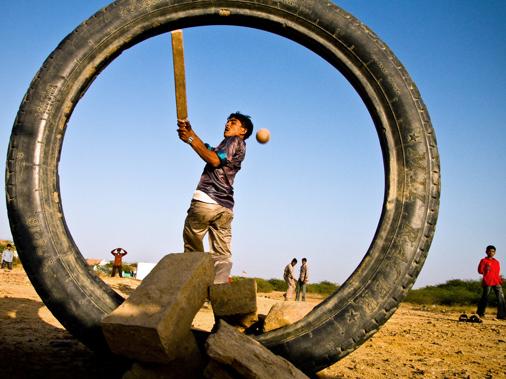 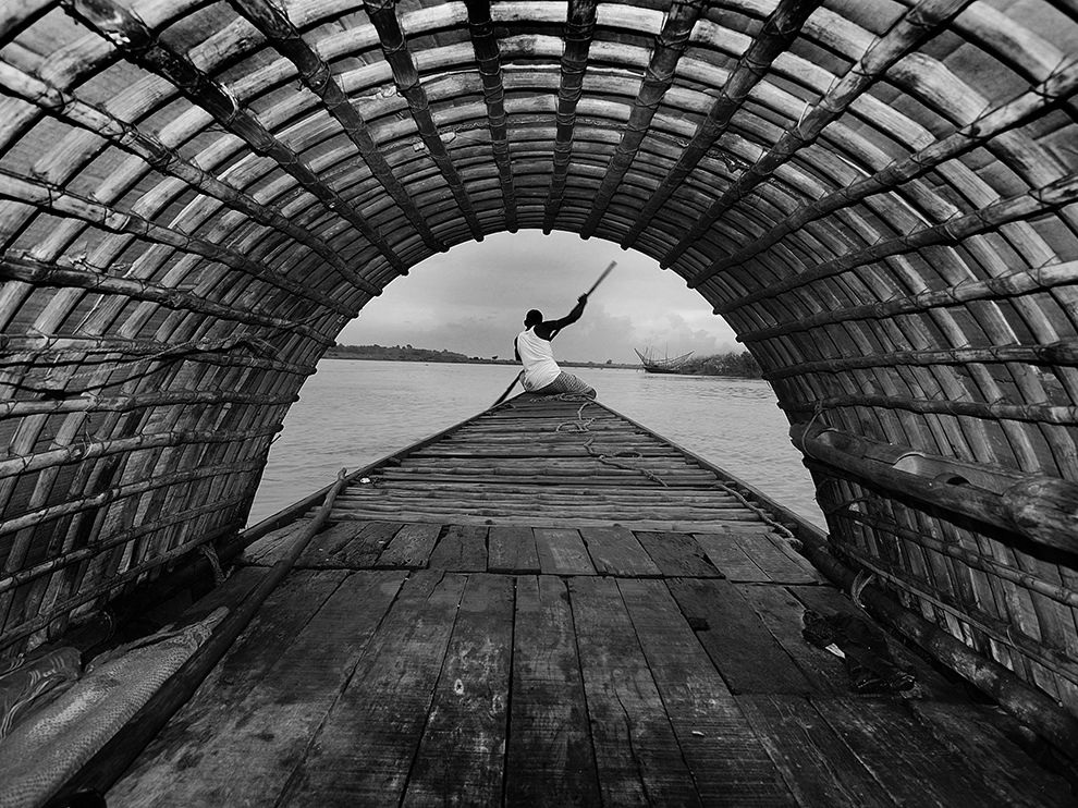 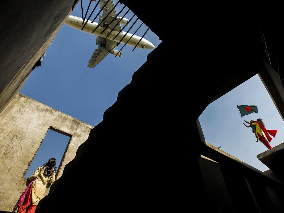     Diagonal Lines - Photo by Orsolya Haarberg  Curved lines - Photo by Pooyan Shadpoor  Horizontal Lines - Photo by Fuvlio Moreilli 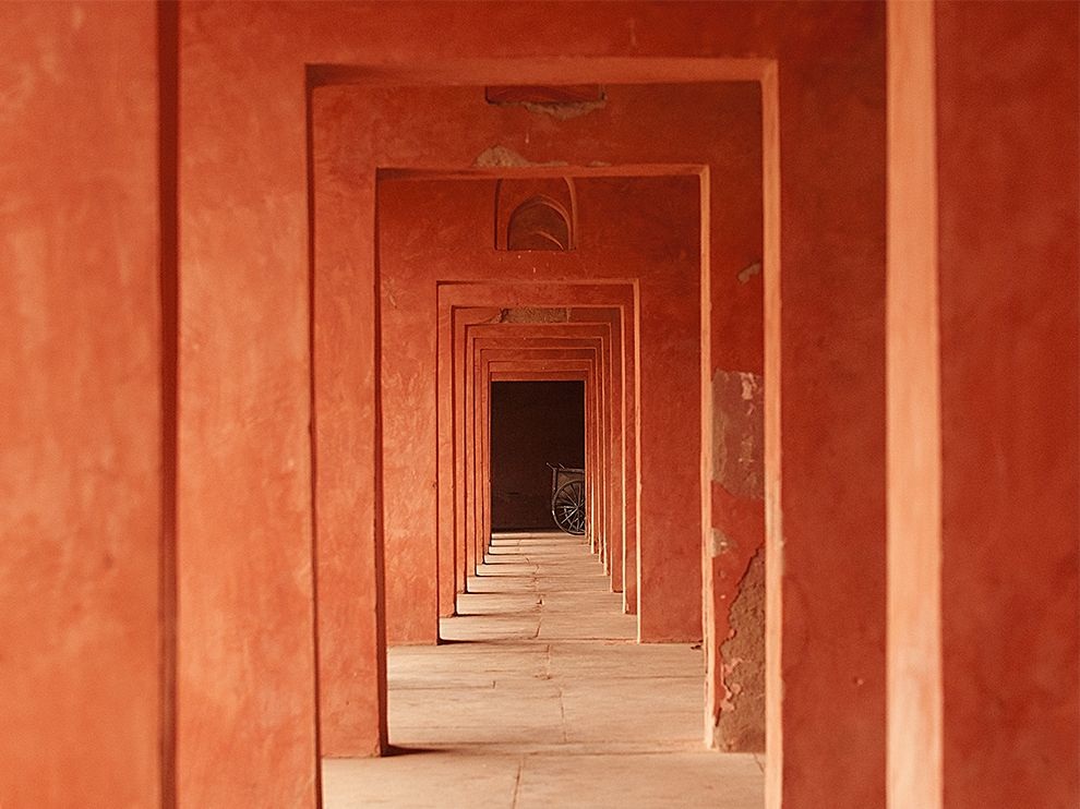 Vertical Lines - Photo by Marco Parenti  Vertical Lines - Photo by Kennis Kauffman  Leading Lines - Photo by Zeqauit Wang 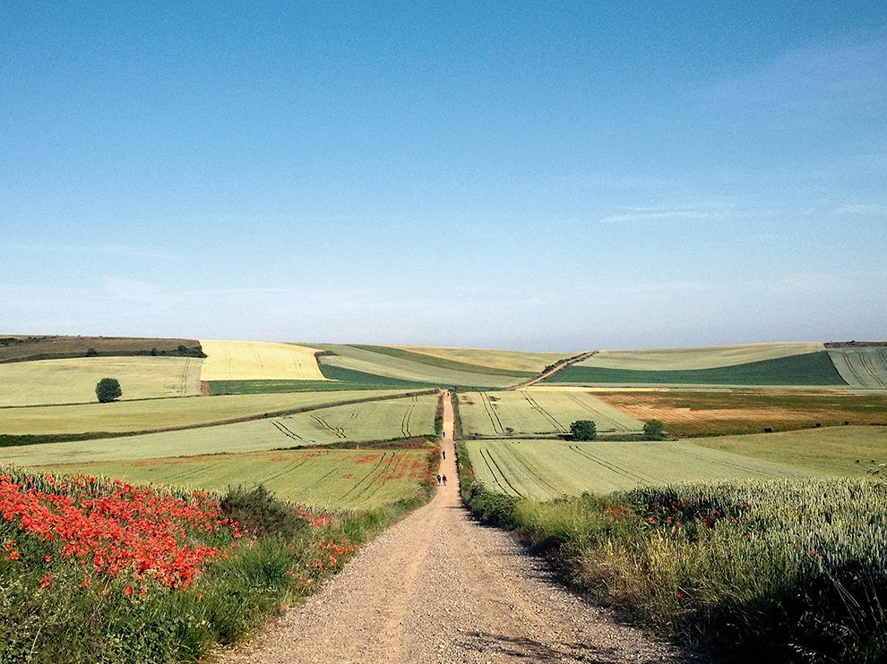 Convergine Parallel Lines - Photo by Michael George  Horizontal Lines - Photo by Jason Van Der Valk  Diagonal Lines - Photo by Rowan Bestmann  Horizontal Lines - Photo by Saranya Chalermchai
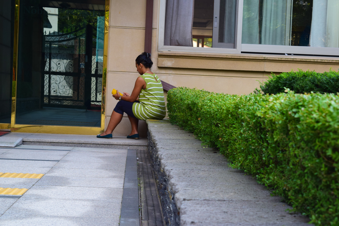
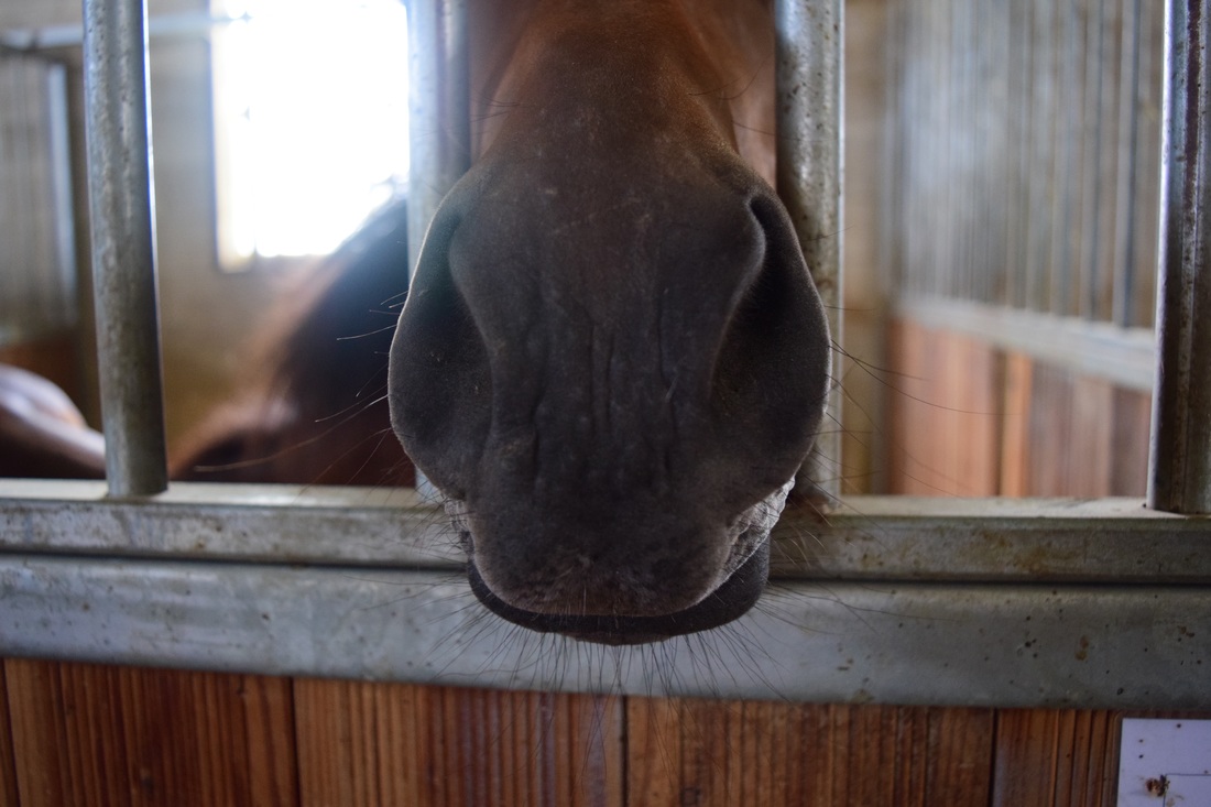
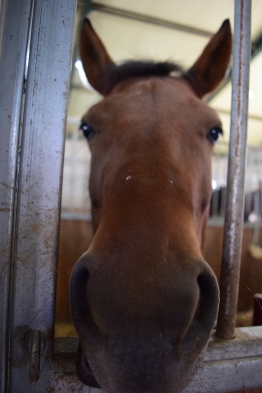 I wanted to take a picture like this where the face of an animal was profile with the camera so that it could follow the rule of symmetry, and I was lucky enough to take this photo. This is one of the small ponies (his name is Mong Mong) that is in the stables I ride in. It is usually hard to get animals to cooperate when taking pictures of them, but Mong Mong stuck his nose out and stayed there until I was done. 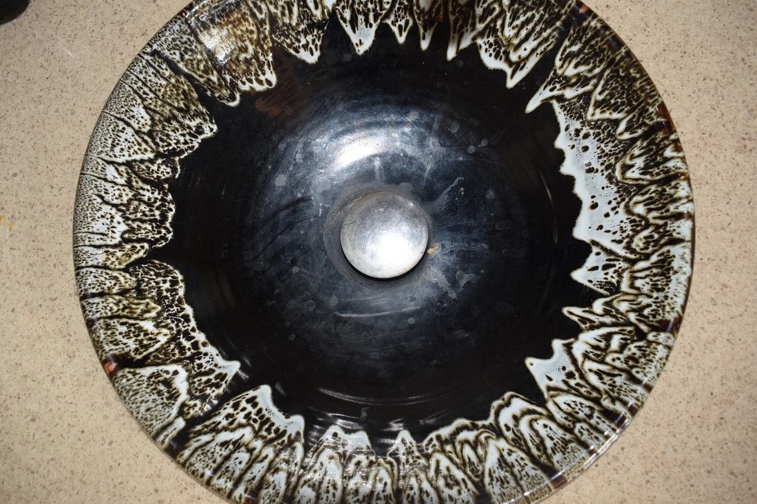 There are a lot of things like this in my house (circlely stuff) and I think that this sink is the prettiest circle thing in the house. I had to stand on a chair to get the birds eye view. I with I could have gotten the whole circle in it, but then the tap would have been in the picture and I couldn't get much higher anyway. 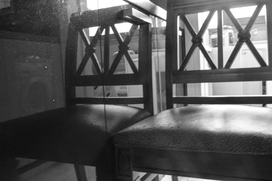 This was the chair I used to get a better view of the sink (above) and when I was about to move it away, I realised that I could take a picture of it and use it for this activity. 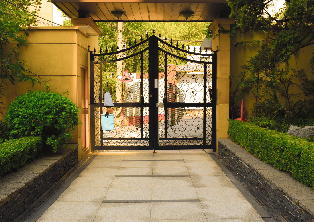 This is the gate to my apartment building. I edited the colours because they are no where near as vibrant, but I really liked the design of the gate. Apart from the annoying bush on the left and the box thingy, I'm glad that everything else matches up well and creates symmetry. 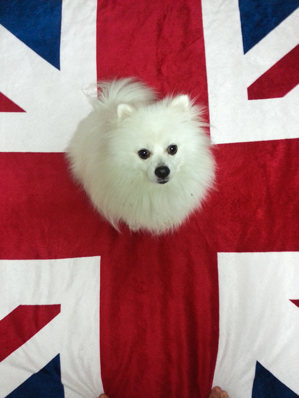 Louis (my dog) was a little stubborn while I was taking the photo, and refused to sit in the center. However, I do like the colour scheme, but in the process I nearly fell flat on my back because I had to take the picture standing on the very edge of the bed. 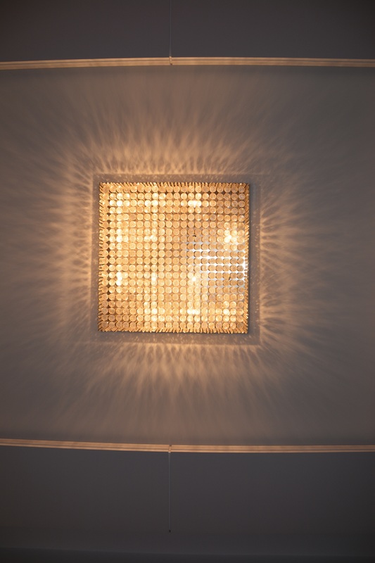 There are a lot of pretty lights like this in my house. This is the main living room light and I really like the style of it and how the light reflects from the glass balls onto the ceiling around it. I had to get lay on my back to get all the lights in. I like how in the picture itself is bright in one place and dark on the outsides. (I was planning to put this picture originally in the place of the chair picture but I forgot)
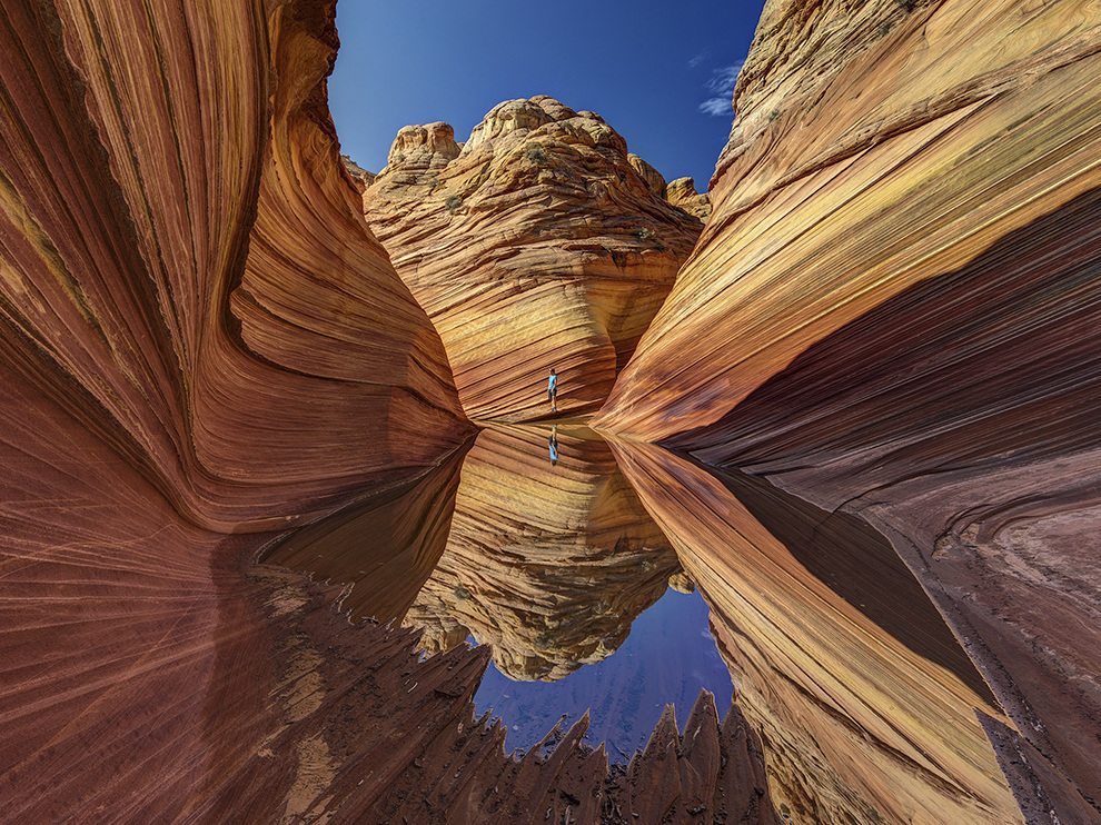
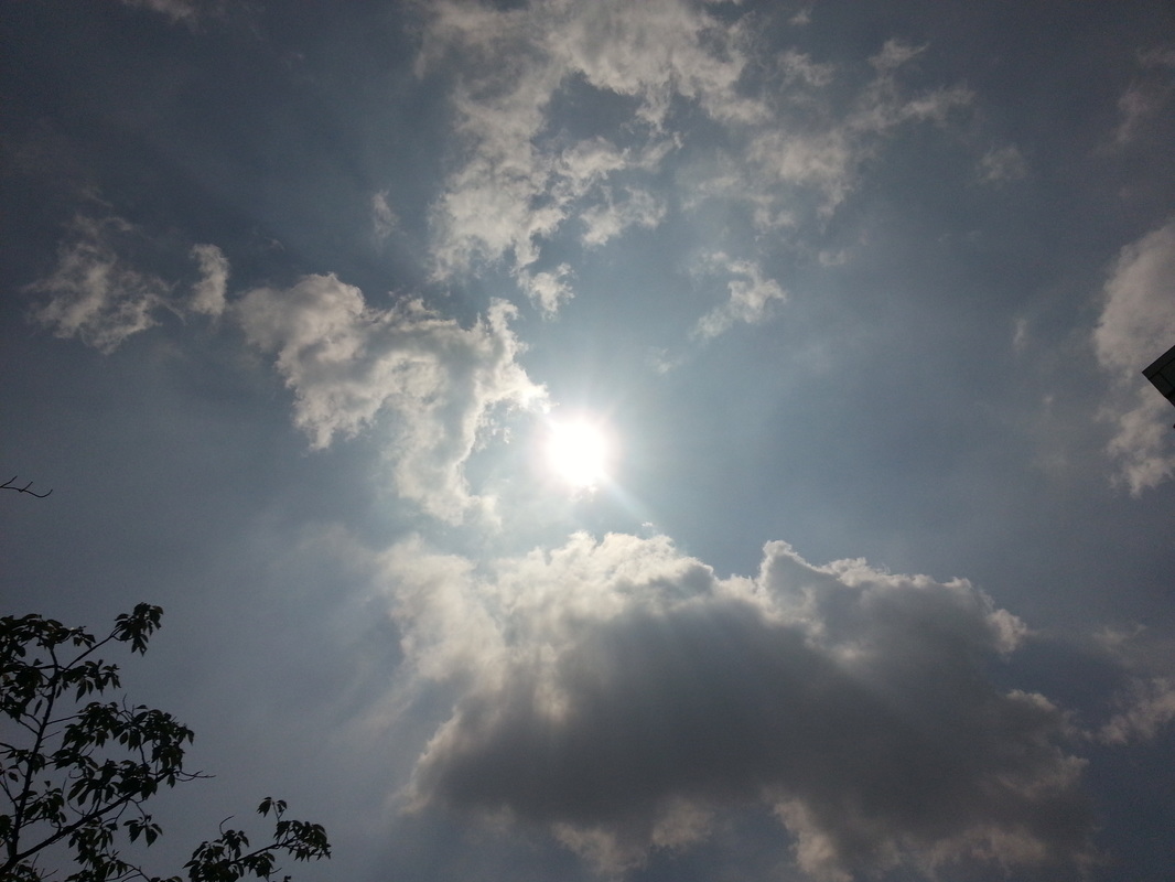
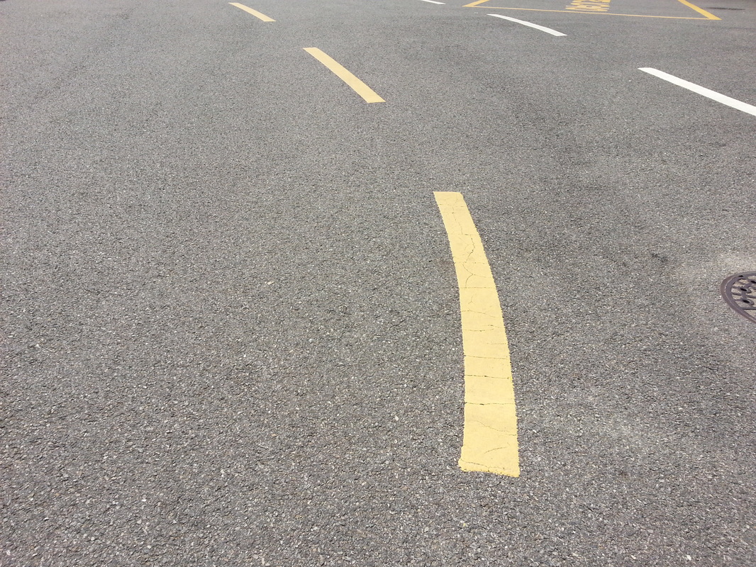
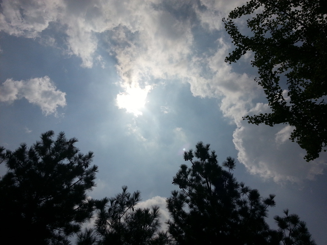
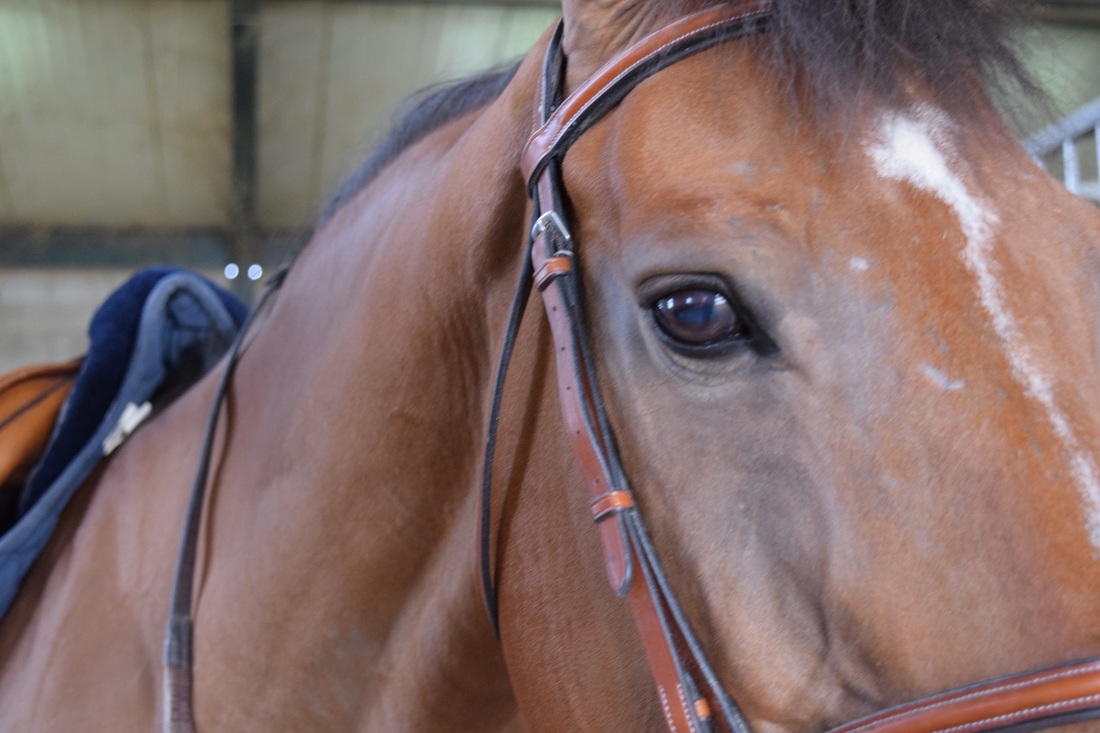
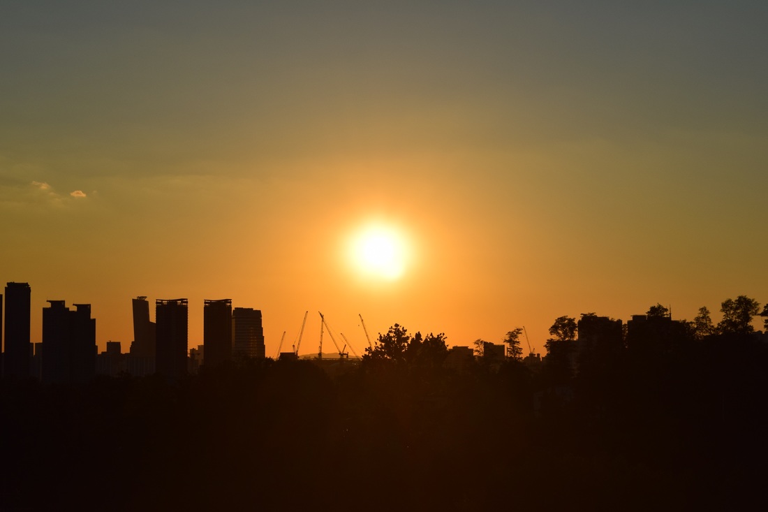
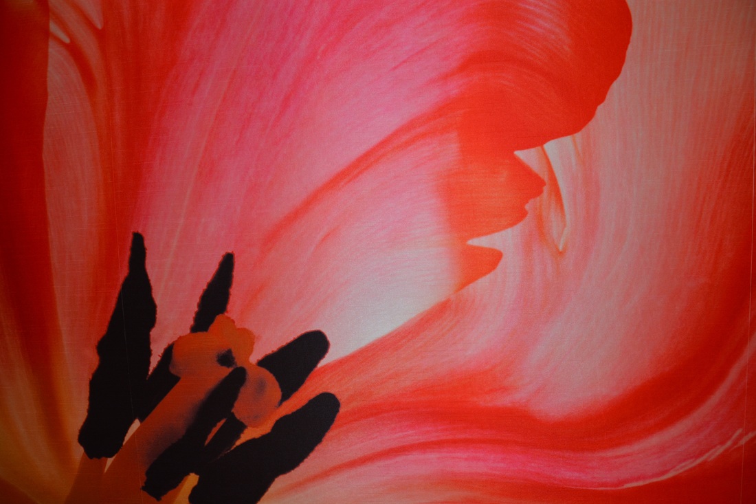
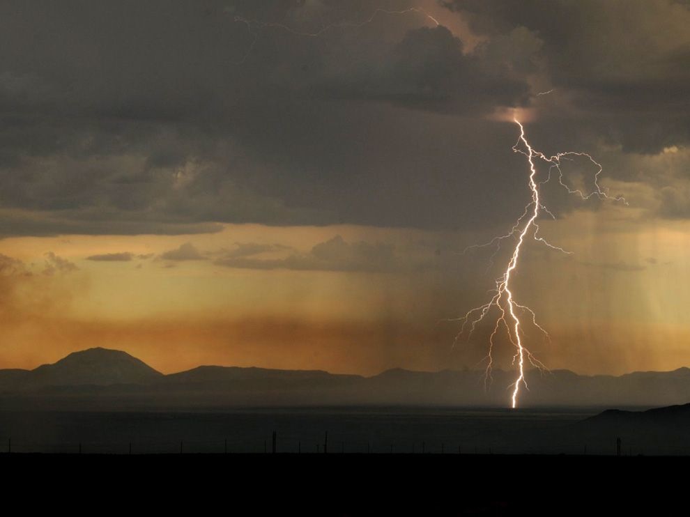
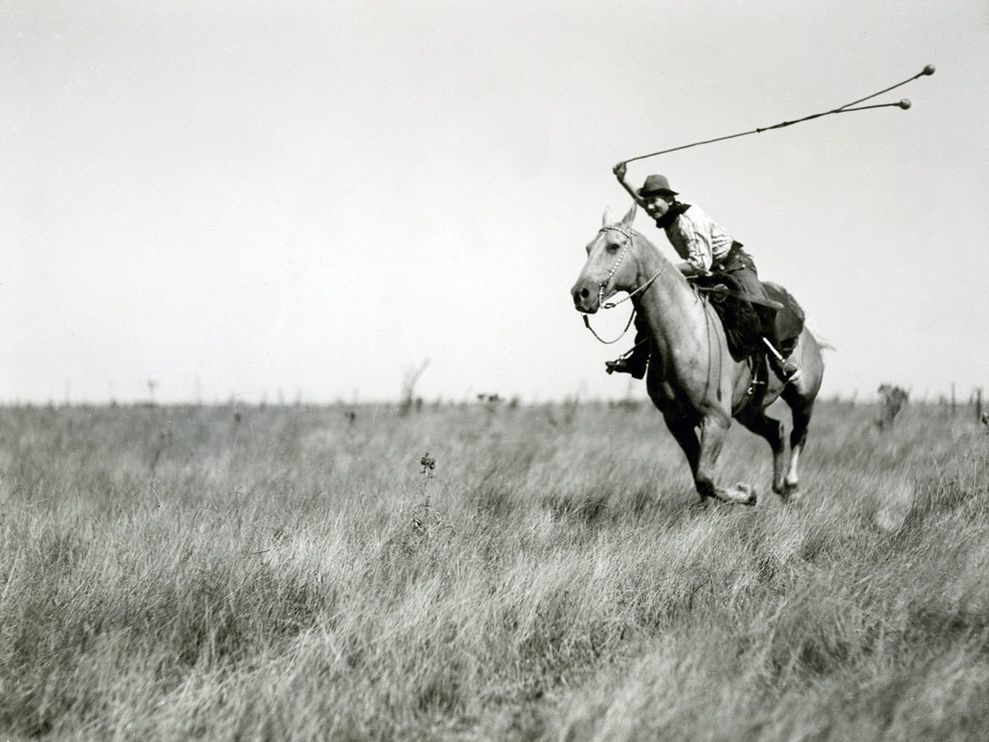
 Leading Lines - For this composition type we were asked to frame a picture so that lines in the scene pointed/led the eye towards the subject of the photo. What I like about this photo is that the line that "leads" the eye towards the subject is a bright green and catches attention easily among the other colours. Something I don't like about it is that the subject is so small compared to everything else in the photo.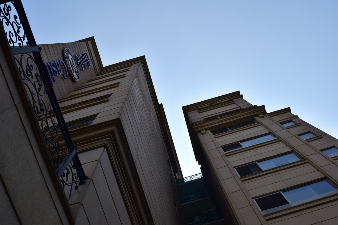 Converging Parallel Lines - For this composition type we had to find parallel lines that came together to create depth. Something that was hard about taking this photo was getting into the right position where the buildings correctly "converged." Next time I think I will try and find a better building that converges more prominently then this one, because this building wasn't very tall I don't think that it effect was as noticeable. If I was able to find a taller building I think it would show the convergence a lot more then this one. 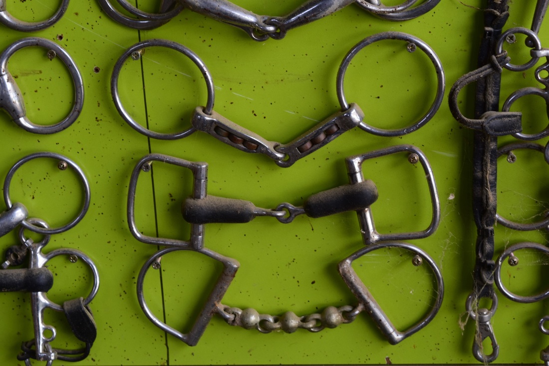 Horizontal Lines - Something I like about this photo is that the background and the other objects surrounding it make the whole picture look a lot better. Something I don't like is that the bits (the metal thingys in the middle) are not completely horizontal. There also seems something about them feels a little "fake." Although, I didn't think about it at the time, next time I will make sure to try and change the "not horizontalness" or whatever else. 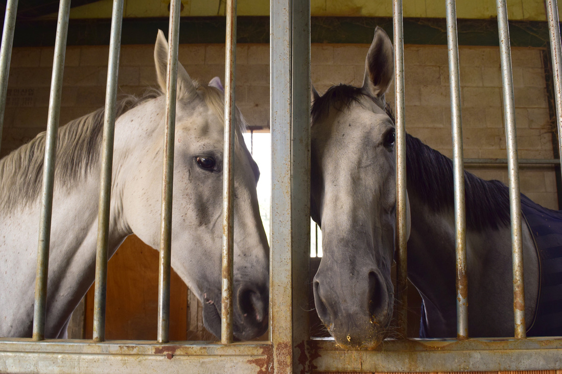 Vertical Lines - For this composition type we were supposed to take a picture that had vertical lines in it, and they are supposed to convey strength and power. Something I like about this picture is that it's somewhat symmetrical and the horses' heads come together. However, the vertical lines are not a prominent as I would like them to be and therefore I don't think they necessarily have the desired effect. 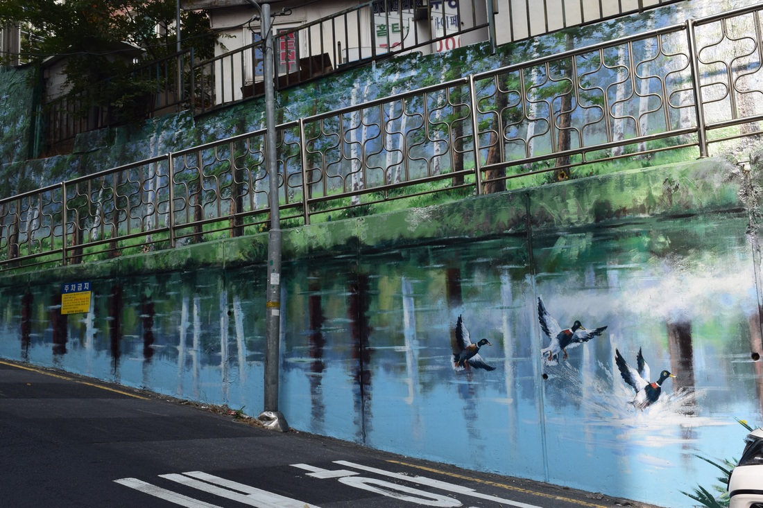 Diagonal Lines - Something I like about this photo is that the subject (the painted wall) is very pretty and I like it a lot. However, What I don't like is that the top of the first wall merges a little with the bottom of the higher (second) wall. This affects the visibility of a couple diagonal lines a tiny bit. I also wish that the lamp post wasn't in the picture, I feel that it ruins the picture a little. 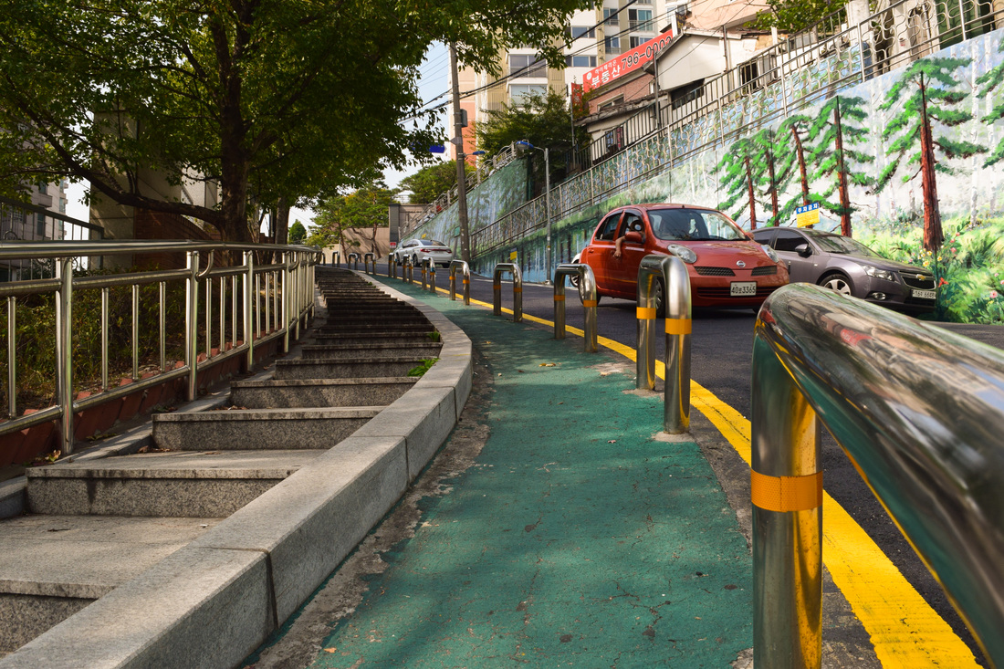 Curved Lines - For the picture we had to try and find something that naturally curved convey gracefulness. A challenge for this photo was to find a spot where the curve in the stairs and road looked good enough to take a picture of. Next time I think I'll try harder to find a spot with a better curve then this one, because looking at it now, I think I could have gotten more of the curve into the picture if I had gone a little further back. Otherwise I like how everything in the picture seems to curve, even the metal pole closest to the camera even though I know it is straight.
Something I learned about rule of thirds is that it is a very simple concept that can easily be applied, and overall makes the picture better. The first time I heard about how moving the object of the picture slightly to the side, I didn't really think it would make a difference. I was proven wrong though, and although it might not be completely apparent in my photos, I was surprised to see how (in professional photos) it really does make a difference. 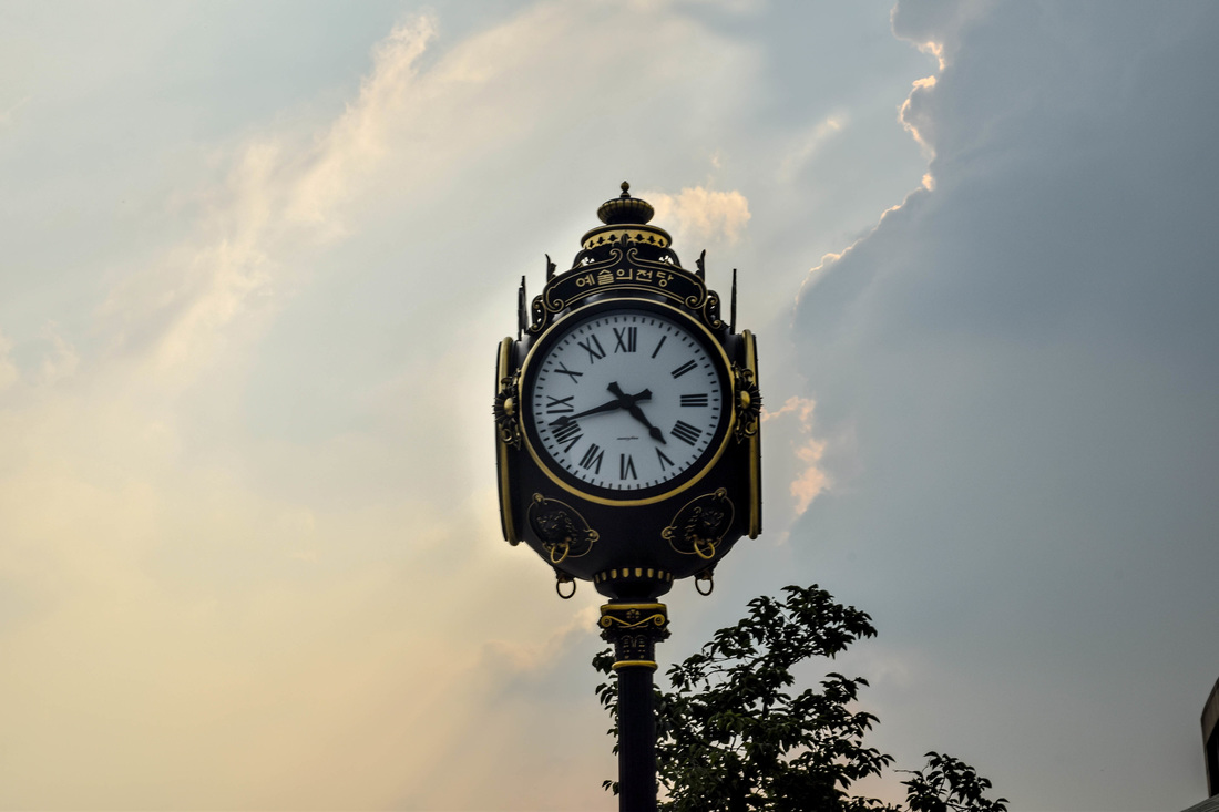 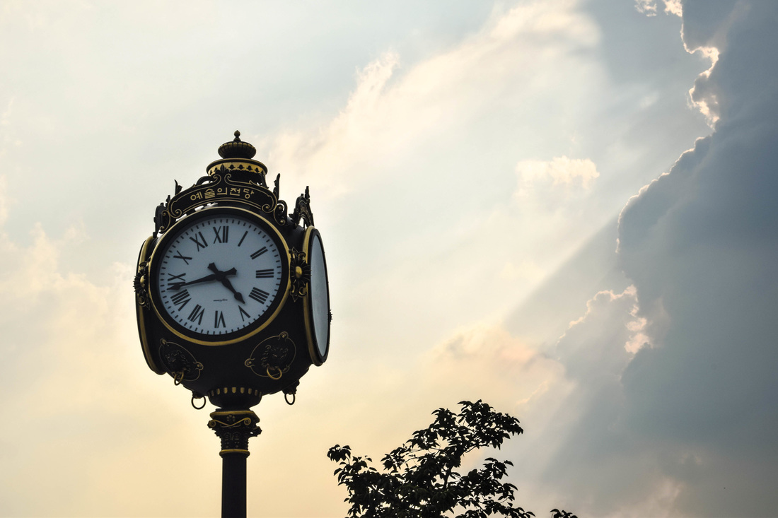 Out of these two pictures, I really don't know which picture I like better. I feel like clock could be placed in the center or on one of the lines and look good, but if I had to pick one it would be the picture following the rule of thirds. I think that the rule of thirds photo overall looks better not because of where it is placed, but rather the surroundings. In the second photo, the light is pointing at the clock, which I think is pretty cool. However, in the first photo the leaves in the background sort of ruin the whole picture for me. If the leaves were out of the pictures I really don't know which one I would prefer.   Out of these two photos I like the one that follows the rule of thirds better. 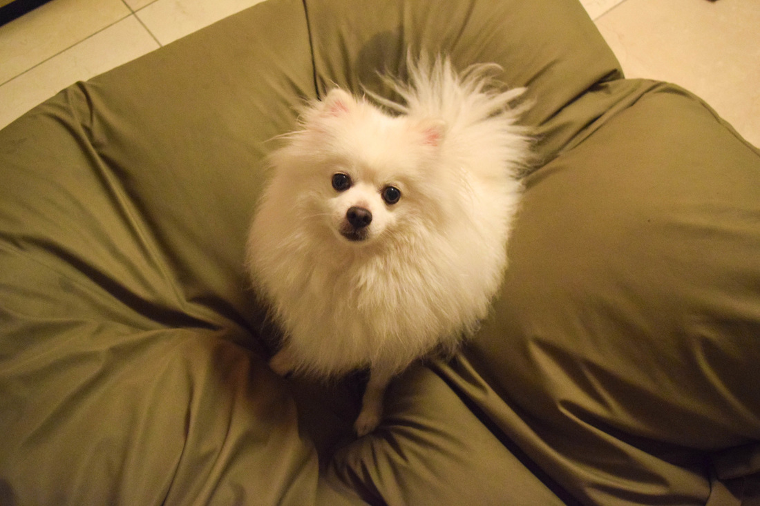  Out of these two photos, I like the one that follows rule of thirds better. I think that placing Louis in the middle makes the picture looks more awkward then the one with him on the line of thirds.
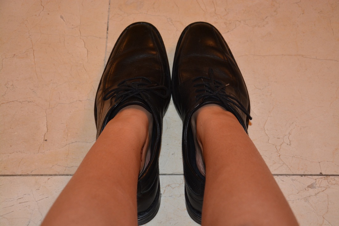
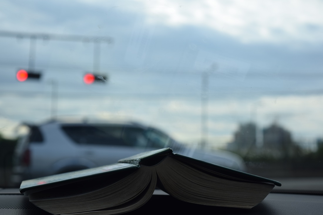
For this activity we were asked to take a scene or object from three different angles to see how we could "tell a story" or see how each picture could differ. We were assigned to do this because it allows us to explore as photographers, and see how a different angle can completely change a picture. For my pictures, I found something that I though looked cool or interesting. Then I took a bunch of pictures with many different angles, and decided on my top 4 (it said a least 3 and I couldn't pick between 2 so I just chose 4) 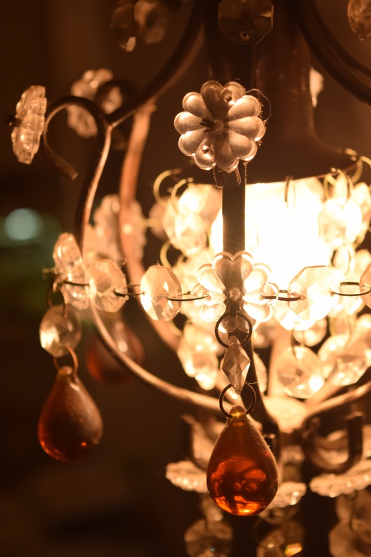 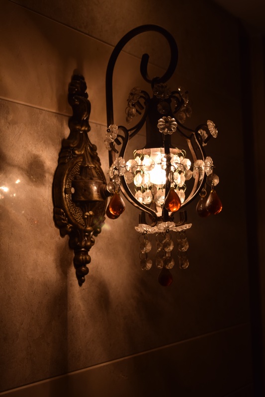 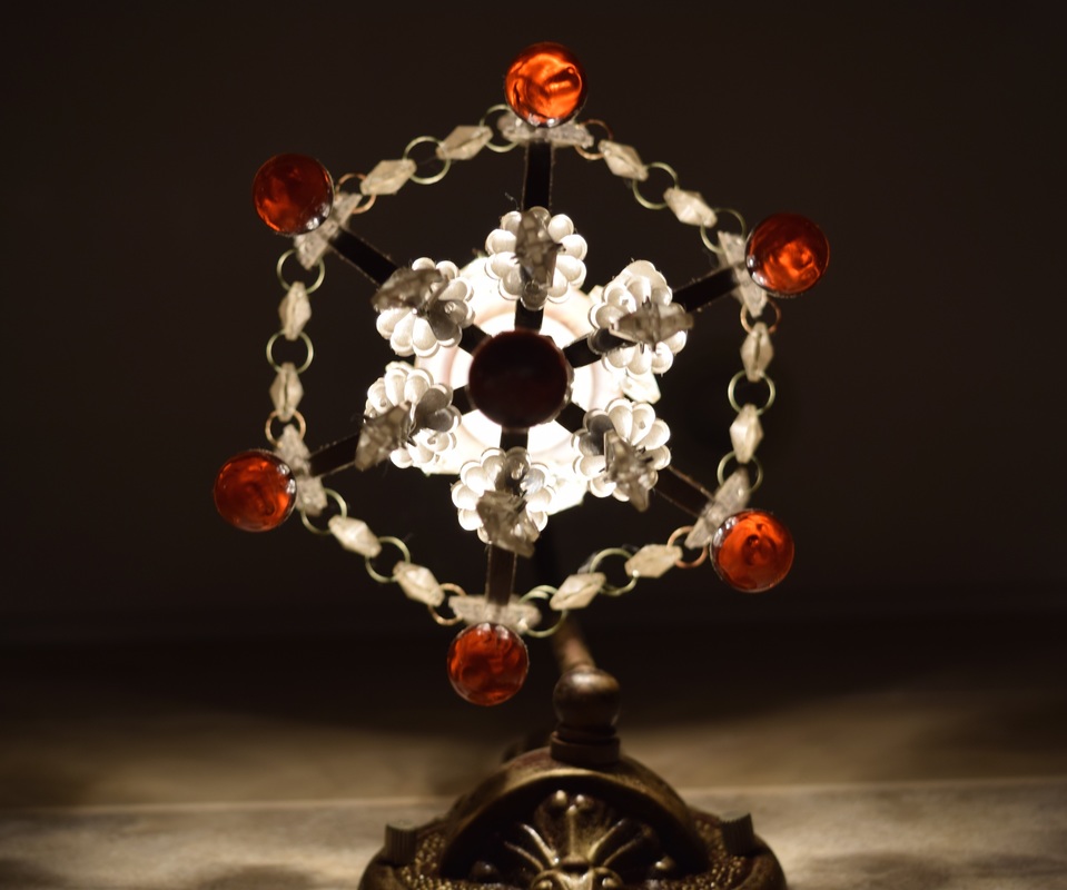 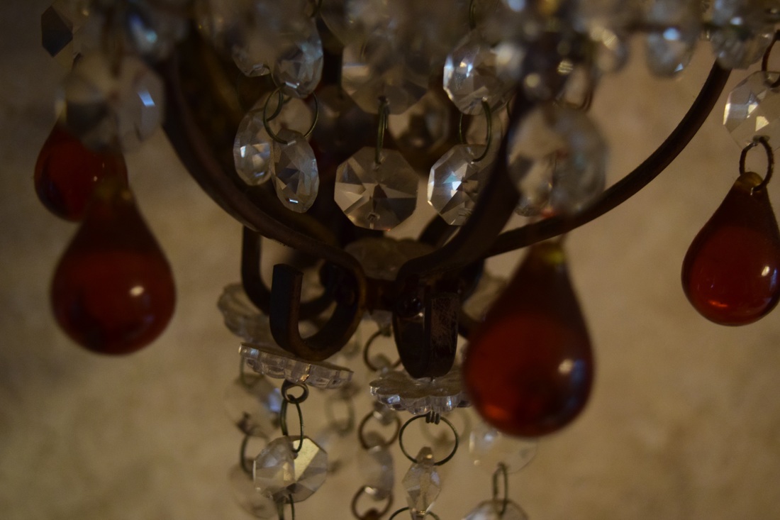 |
AuthorWrite something about yourself. No need to be fancy, just an overview. ArchivesCategories |
 RSS Feed
